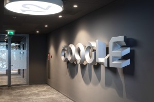
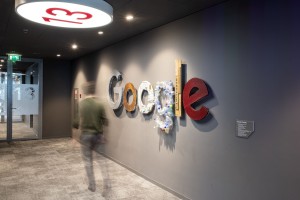
Branding for the Google Offices, signage and wayfinding.
Doodle Logo
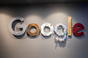
We have designed Doodle logos for Google Amsterdam. The Doodle logo is a variant of the Google logo with a local or specific theme. The Doodle has a story that has a link with Dutch themes and topics that have an impact on humanity.
The Doodle logos are the main identity in the head office and guide as inspiration for employees and visitors at Google
Inspiration
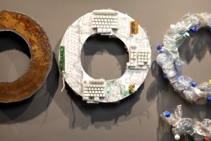
Google is one of the largest tech companies in the world. The people who work at Google (Googlers) create services that impact the lives of people who use Google products. Within the design, we have tried to give direction to thinking and circular thinking on a subconscious level. The starting point is; if the logo makes even a small impact on the work of an individual Googler, this can have a major effect on the people who ultimately use Google products.
The Doodle logo designs contribute to thinking about change. The transformation to thinking and circular thoughts is a source of inspiration when you see the design in space.
Thoughts
In designing, psychology, graphic and spatial design, execution and realization come together. What does a design do with the people in the space? In what way does the design contribute to the work of Googlers. How can a Doodle make an impact and become one with its surroundings. This approach results in a unique design with a Google identity at first glance with a deeper thought.
Wayfinding
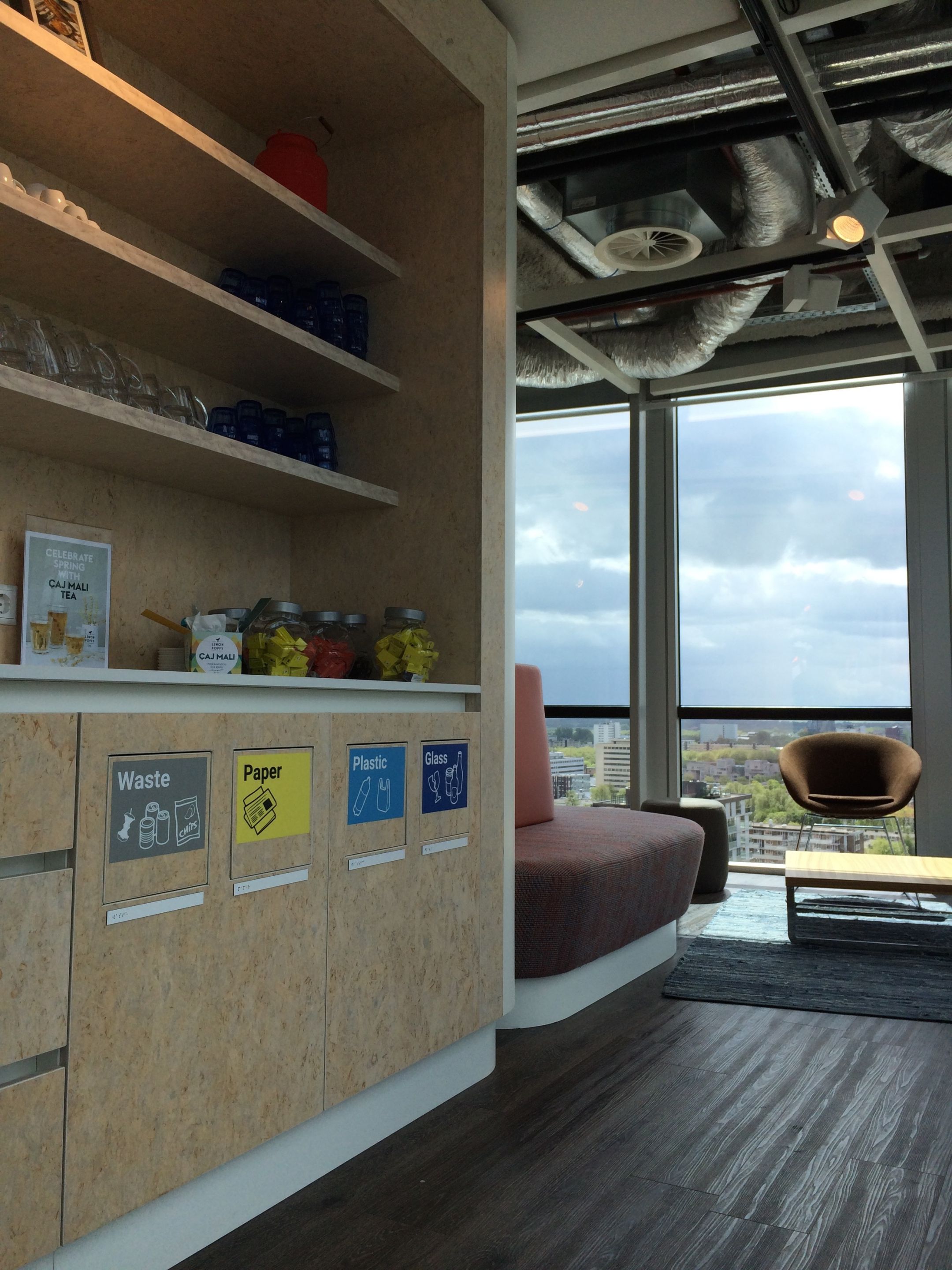
The offices and restaurant are frequently visited throughout the day. We have created a comprehensive wayfinding system for first-time visitors and Googlers to find their way in and around the offices. The visual language includes;
- Doodle Google Logo designs
- Wayfinding system for routing and idenitifcation
- Meetingroom route layout and graphic elements
- Acoustic panels and graphic design
