Essential Design Principles for Hospital Wayfinding [2023]
How Can Wayfinding Design Improve Hospital Navigation and Enhance Patient Experience? Discover how a patient-centered approach to wayfinding can improve hospital experiences.
![Essential Design Principles for Hospital Wayfinding [2023]](https://www.designworkplan.com/media/pages/read/hospital-wayfinding/ce81452f46-1722358144/hospital-wayfinding.jpg)
Wayfinding
Finding your way in a hospital setting can be tricky. The stress of finding a department or destination in a (unfamiliar) building can a challenging experience.
What is there was a way to make finding your way in a hospital easier? This is where design discipline wayfinding comes into play and has the potential to improve the patient experience.
Wayfinding is a multidisciplinary design field that combines principles of cognitive psychology and human behavior for a better understanding of the surroundings.
For hospitals, wayfinding aims to address the following critical issues:
- How can we make it improve wayfinding for patients?
- Which design principles can assist to enhance the visitors experience?
- How can we create an accessible environment for all users, including people with disabilities?
In this article we will explore the importance of wayfinding principles in hospitals. The challenges we face along the way and the innovative solutions that will improve the way patients navigate healthcare settings.
By exploring the role of both traditional and digital wayfinding tools, we will highlight the potential of well-designed wayfinding to improve wayfinding in hospitals. The goal is an improved patient experience and ultimately to contribute to reduced stress when visiting a hospital.

The challenges of hospital signage
Orienting and navigating a hospital environment can be challenging for patients, visitors and even medical staff. With wayfinding research we can look through the 'eyes' of the users and understand the bottlenecks and success factors of effective wayfinding.
In this chapter we explore the main challenges of signage and take a closer look at why these problems can arise.
A. Complexity of buildings
Signage 'shows' people the way in buildings and environments. A hospital building is usually a large building with several floors, wings and departments. A hospital can have more than 100 different departments, from Emergency Department, Intensive Care Unit (ICU), Surgery, Internal Medicine to Orthopedics, Radiology and Oncology. This can include many subspecialties.
A hospital usually consists of many departments and specialists, located throughout the hospital building, connected by squares and corridors.
Why can a hospital building have a complicated or confusing layout?
- Due to expansion and renovations, buildings can be adapted over time. Expansion of wings and/or, for example, an attached building can lead to a confusing layout.
- Due to functional requirements of departments, part of the hospital may not be accessible. As a result, to reach a certain department, you can get there via a detour.
How does (building) complexity affect patients and visitors?
- A complicated layout brings increased stress. Can I find the department? Am I on time?
- Difficulty finding departments. Where is department xx? How do I get to the department?
Why are hospital environments naturally stressful?
- Due to health problems and emotional nature, a hospital can be experienced as stressful. What do I have? Can the doctor help me?
- Due to time-bound appointments and procedures in a hospital. Am I on time? Where is...?
How does this stress affect signage?
- Due to increased stress, people (usually) have a reduced ability to process information. Where should I look?
- Due to an increased reliance on intuitive references. How does the signage work?
What are the unique signage challenges that different users face?
- Patients, visitors are not familiar with the layout of the building. Where's what?
- Patients, visitors have cognitive or physical limitations. May have difficulty processing the information.
- Non-native speakers and/or have difficulty reading the signage.
Why is it important to consider user needs when designing signage?
- Ensuring accessibility and inclusiveness principles, design-for-all concept.
- Reduce the risk of disorientation
- On time for an appointment
- Consistent information provision towards a patient and visitor gives peace of mind in orienting and navigating in an (unfamiliar) environment.
Why can it be difficult to maintain consistency in hospital signage systems?
- Due to the variety of systems and information provision around patient information.
- Information such as on the website, call letter, reception desk, ticket, referral letter and signage must be consistent for a clear picture towards the patient, visitor.
By examining these challenges in wayfinding research, we understand the user and thereby identify bottlenecks and success factors.

Wayfinding strategy for hospitals
In this chapter we discuss different ways of referring that can help improve orientation and navigation in the hospital. By implementing these strategies, hospitals become more user-friendly and accessible, reducing the stress associated with navigating healthcare facilities.
- Well-thought-out signage
This includes clear, concise, and easy-to-understand signage at key decision points, such as at entrances, hallways, elevators, stairways, and wards. Ensure consistency in design, colors and typography for clear communication.
Example: A hospital can create a wing layout for different departments such as A, B, C, D, etc. making it easier for users to track their destination.
- Landmarks and Visual Recognition Points:
Including landmarks and visual identifiers in the hospital environment can aid orientation and make it easier for users to remember the route.
Example: Placing distinctive artwork, architectural features or color schemes as landmarks in the hospital.
- Digital Wayfinding:
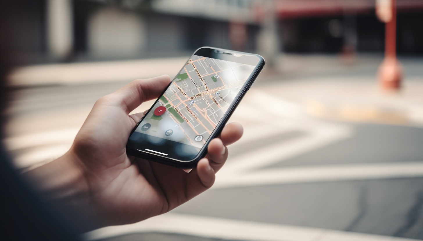
Digital wayfinding, such as interactive kiosks, mobile apps and touchscreens, can provide real-time information and personalized directions to help users navigate the hospital more easily.
Example: Digital screens in the hospital for displaying relevant information for users. Where am I? Where can I find department xx? And how do I get there?
- Staff training and support:
Ensuring that medical staff and employees are well aware of the signage system and tone-of-voice towards patients and visitors.
Example: A hospital could offer training sessions to employees to familiarize them with the signage and teach them how to effectively help visitors navigate the hospital.
- Inclusive Design and Accessibility:
Hospitals should be accessible to everyone, including people with reduced mobility, the visually impaired or the hearing impaired.
Ensure that (digital) signage takes these groups into account by using clear, high-contrast fonts, tactile elements, Braille and audio signals where appropriate.
Example: Tactile markings on the floor or braille signs assist to the help the visually impaired to navigate the building and find the right department.
By implementing these signage strategies and addressing bottlenecks and success factors, healthcare facilities can significantly improve the user experience of patients, visitors and staff. This leads to less stress, increased satisfaction and ultimately better healthcare outcomes.

Digital wayfinding in hospitals
Digitization in signage is important for improving the overall user experience in a hospital. Digital tools provide real-time information, personalized routes and additional resources to assist patients and visitors in navigating complex hospital environments.
In this chapter we discuss examples and use cases for digital wayfinding.
- Real Time Information:
Digital signage can provide real-time information and updates about, for example, waiting times, routes and where you are in a hospital.
Example: Digital information signs can display the current waiting times for departments and/or other hospital services.
- Integration with Social Media and Online Communication:
A social media integration platform to assist patients and visitors plan their visit, receive (route) information and share feedback.
Example: A hospital can implement a (AI) chatbot to assist users for navigating questions, ask for directions, and for instance scheduling appointments.
- Digital Screens:
Interactive screens can provide patients with real-time information about their destination, directions and additional services such as finding a nearby restroom or coffee corner.
Example: A hospital can place interactive screens or a kiosk at the entrance and install it on every floor, where visitors can receive personalized route information.
- Mobile Information :
Show relevant information on digitale signage screens, such as routes and destinations in the hospital. Think about including a "you are here" on a map and/or use directory signs for an overview of departments.
Example: A hospital can display the information in a mobile environment, which is linked to the hospital's website.
- Augmented Reality (AR) Signage:
AR technology could overlay digital information in the real environment, such as arrows and text, using a smartphone's camera.
Example: An overlay that guides users using digital cues that overlap with the real environment.
The implementation of digital signage in hospitals creates an integrated patient experience and approach. The starting point is to use technology for a more personalized route and real-time updates, resulting in an improved user experience.

Wayfinding scenarios
In this chapter we discuss different scenarios for referring users in a hospital building. A new or existing hospital building usually has an entrance, exit, atrium, floors, corridors and wards. Destinations in a hospital can be 'coded' by using a wayfinding strategy. By means of a reference key it is possible to easily reach destinations. Below are a few examples:
- Route numbers
Organizing the hospital with route numbers. This means that each destination gets a route number. Patients, visitors use the route number to reach a destination. Route numbers can be ascending or linked to, for example, a floor.
Example: Route 142, where 1 stands for floor 1 and 42 is the sequential number. This way you can always find where you are in a hospital.
- Wing layout
With wing layouts, lift points such as elevators or stairs are classified with a name or letters. For example A, B, C, D, etc. With wing layouts, the letters are usually followed by a number, which stands for the floor.
Example: C2, where C stands for the wing and 3 for the floor. An addition of a number can indicate even further specifications, such as C2-12. Where, for example, 12 is the waiting area on wing C floor 2.
- User-friendly (digital) additions
This scenario adds tactile and auditory information to wayfinding scenarios for reaching foreign speaking people or for people who have difficulty walking or have reduced vision capacity.
Testing the wayfinding scenarios is important to gain feedback from users. A scenario is building, process and user-related. Implementing a clear and concise wayfinding scenario improves an intuitive way finding destinations in a hospital.
| Main Takeaway | Explanation |
|---|---|
| Importance of wayfinding principles | An integrated approach in wayfinding contributes to the improvement of routing and hospital experience. |
| Challenges in hospital signage | Hospitals face challenges due to the (complex) layout, time-sensitive and emotional nature of visits, and various user needs. |
| Wayfinding strategy | An effective wayfinding strategy includes clear signage, landmarks, digital tools, and staff training focused on the (end) user. |
| Digital wayfinding solutions | Digital wayfinding solutions, such as real-time information, integration with social media, digital screens, mobile apps, and AR, can enhance the overall user experience. |
| Wayfinding scenarios | Different wayfinding scenarios, such as route numbers, wing layouts, and user-friendly digital additions, can be deployed to improve the patient journey in hospitals. |
Conclusion
A wayfinding design strategy plays an important role in improving the user experience in a hospital.
Implementing a well-thought-out wayfinding strategy and scenarios, users can orientate and navigate more easily. The starting point is to improve the user experience, which contributes to a positive image of the hospital.
The roll-out of both fixed and digital wayfinding tools, such as signage and digital displays, can help provide an integrated approach and experience tailored to users' requirements and needs.
In conclusion, a wayfinding design and strategy are indispensable for creating an accessible, safe and user-friendly environment in hospitals. It is vital that hospitals and wayfinding design studios work together to implement effective solutions that help patients, visitors and staff navigate and feel comfortable in these complex environments.
Let's work together
More on hospital wayfinding, contact us →